Mahsa khoshsaadat
Art reviews
Mahsa khoshsaadat
"The pairing of the phoenix in this work, and the contrast with its solitary nature—which is the most distinctive feature of the phoenix—is the factor that transforms ash and grey into color and a rainbow. The maturation of grey into the perfection of multicolor.
'From Maturity to Rainbow'"
Written by: Keyvan Qaenian
Architect
Collector
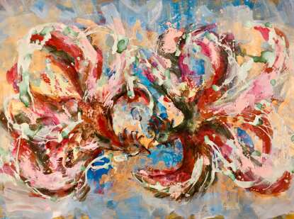
Mahsa Khoshsadat's paintings, through their psychological and visual play with colors, possess a unique ability to create profound impacts on the human soul and mind. With a deep understanding of the role and power of colors, this artist offers a distinct visual experience to the audience. The dominant colors in her works are red, yellow, and blue—each affecting the human psyche profoundly, either consciously or unconsciously.
In Khoshsadat's works, red holds a special place. This color neither leans toward blue nor shows traces of yellow. The red in her paintings is vibrant and intense, refusing to fade easily. In many of her pieces, red represents life, rebellion, and revolution. Its versatility allows the artist to mold it into various shapes and combinations, blending it with yellow and blue to create a new world.
Yellow in her works symbolizes brightness, knowledge, and enlightenment. In some paintings, it appears like golden halos that illuminate saints, depicted with great strength. In Khoshsadat's hands, yellow, much like Byzantine gold, becomes a symbol of intellectualism. Simultaneously, this color conveys deeper concepts beyond just brightness and knowledge.
Blue, another key element in her works, signifies deep and active spirituality. Unlike red, blue alludes more to the inner human being and their connection with the soul and mind. In Khoshsadat's art, blue often appears in shadows and darkness, always accompanied by a sense of tranquility and eternity.
In summary, Mahsa Khoshsadat's works, by combining these three primary colors, not only have a strong visual impact on the viewer but also allow the audience to immerse themselves in a world filled with passion, intellectualism, and spirituality. These colors neither tire nor dull the senses; instead, they draw the viewer in with both spiritual and worldly power, prompting them to reflect.
This critique is a token of appreciation for an artist who, with colors, creates a new world and invites every viewer on a visual and emotional journey.
Iman Seyedi
Writer and Researcher
University Professor (Shiraz)
نقاشیهای مهسا خوشسعادت بهواسطه بازی روانی و بصری با رنگها، توانایی منحصربهفردی در ایجاد تأثیرات عمیق بر روح و ذهن انسان دارند. این هنرمند با درک کامل از نقش و قدرت رنگها، تجربهای متفاوت از حسهای بصری به مخاطب ارائه میدهد. رنگهای غالب در آثار او شامل قرمز، زرد و آبی است؛ رنگهایی که هرکدام به شکلی عمیق و ناخودآگاه بر روان انسان تأثیر میگذارند، چه با آگاهی بیننده و چه بیخبر از آن.
در آثار خوشسعادت، رنگ قرمز جایگاه ویژهای دارد. این رنگ نه به آبی متمایل است و نه از زرد اثری در آن دیده میشود. قرمز در آثار او پرشور و درخشان است و بهسادگی خاموش نمیشود. در بسیاری از کارهای او، این رنگ نشاندهنده زندگی، شورش و انقلاب است. انعطافپذیری قرمز به هنرمند این امکان را میدهد که آن را به اشکال و ترکیبهای مختلف درآورد، همانطور که میتواند آن را با زرد و آبی بیامیزد و جهانی تازه خلق کند.
رنگ زرد نیز در آثار او نماد روشنایی، دانش و معرفت است. این رنگ در برخی نقاشیها همانند هالههای طلایی که مقدسین را نورانی میکنند، با قدرت به نمایش درمیآید. زرد در دستان خوشسعادت، همچون طلای بیزانس، نمادی از روشنفکری است. در عین حال، این رنگ قادر است مفاهیمی عمیقتر از روشنی و دانش را به ذهن مخاطب منتقل کند.
رنگ آبی، دیگر عنصر کلیدی در آثار خوشسعادت، نشاندهنده معنویتی عمیق و فعال است. این رنگ، برخلاف قرمز، بیشتر به درون انسان و ارتباط با روح و ذهن او اشاره دارد. آبی در آثار این هنرمند معمولاً بهصورت سایهدار و در تاریکیها جلوه میکند و همواره با آرامش و جاودانگی همراه است.
در مجموع، آثار مهسا خوشسعادت، با تلفیق این سه رنگ اصلی، نهتنها از لحاظ بصری تأثیری قوی بر بیننده میگذارند، بلکه به مخاطب اجازه میدهند تا در دنیای پر از شور و هیجان، روشنفکری و معنویت او غوطهور شوند. این رنگها نه خستگی ایجاد میکنند و نه کرختی، بلکه با قدرتی روحانی و دنیوی، توجه مخاطب را جلب کرده و او را به تفکر وامیدارند.
این نقد به پاس قدردانی از هنرمندی است که با رنگها جهانی تازه میسازد و هر بینندهای را به سفری بصری و احساسی دعوت میکند.
ایمان سیدی
نویسنده و پژوهشگر
استاد دانشگاه. (شیراز)
"جفت بودن ققنوس در این اثر و تقابل یا مفرد بودن آن که شاخصترین خصوصیت ققنوس است، عاملی است که خاکستر و خاکستری را به رنگ و رنگینکمان تبدیل میکند. بلوغ خاکستری تا تکامل رنگا رنگ
«از بلوغ تا رنگینکمان»"
نوشته : کیوان قائنیان
مهندس معمار
کالکتور
Ways of communication


